Project Gem Charlotte: The Beginning
You’ve got to roll with the punches to get to what’s real. - David Lee Roth
Follow along with me as I recount how this project went. This will be a multi-part blog and this week will focus on how the project started and reveal of the initial design/ selections.
I really had a lot of fun working on this project. I worked with a local real estate investor on this rehab and boy was it a doozy! As one of my first projects under the Designs By Damienne brand, it was chock full of surprises, learning experiences and opportunities to modify/streamline my processes. Prior to launching my business, I mapped out how an ideal e-design project would go from start to finish; however, this project was local and required a little bit more finesse. For that reason, I had to modify my process to accommodate both standard e-design actions and those that would typically fall under a full-service design project.
Step One: Walking in, my first impression was “There’s so much… STUFF”. It looked like anything of real value had been removed from the home, but they left behind a lot of shoes, clothing, personal effects, and junk. I could see that the house needed a lot of work before it would be ready for resale, but most of it seemed to be cosmetic. Structurally everything appeared to be in order but would need to be confirmed once the house was cleared. Not to mention it was hard to get any accurate measurements amongst all that clutter. I let my client know that I would need to return once all the debris was hauled away before I could begin.


Step Two: Once my client let me know that they house had been cleared it was time for me to get over there and take detailed measurements so that I could begin coming up with the design for the rehab. Now, this process was TEDIOUS. Typically, my clients provide the measurements for my e-design packages, so I don’t usually take the measurements myself. However, this was a whole house project, and I was going to be specifying things like flooring and tile (these items are usually sold by the square foot) I didn’t want to leave the accuracy of these measurements to the client. That being said, getting accurate overall measurements while noting the measurement and placement of architectural elements (Doors, Windows, Cased Openings, etc.) is a time-consuming process and results in a spreadsheet sorted by space itemizing the measurements for everything. I use these measurements to create the floor plan and now I’m ready to get to work.
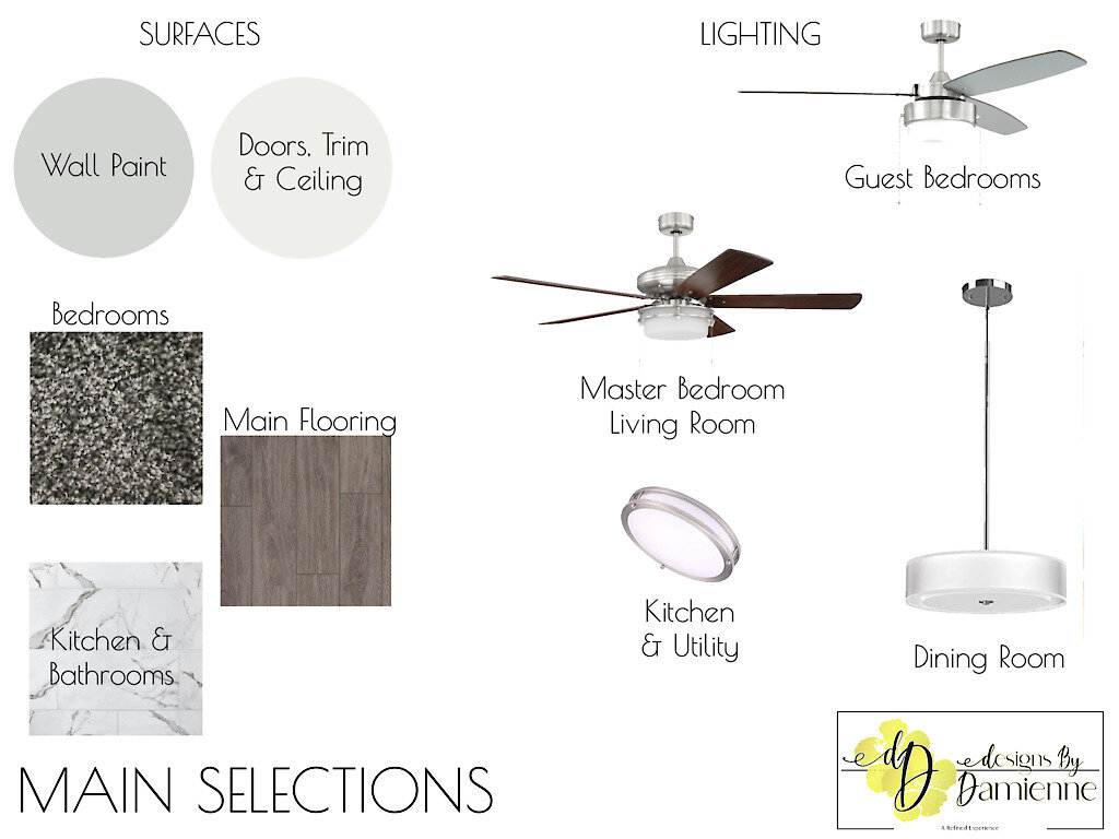
Step 3: Now the fun part starts! I came up with a general design theme and color palette for the project. If you recall from the before pictures (scroll up if you need a refresher) there was A LOT going on color wise initially; lots of different colors without a sense of cohesiveness throughout so I knew that had to go! Since this was a rehab and the ultimate goal was resale, I knew that I wanted to select a very neutral color palette that would complement the new owners own design style while giving the house an updated modern feel. I also had to always keep the budget in mind because as an investment property every penny counts so I prioritized sourcing items that would give the house a luxury feel without destroying my client’s profit margin. Check out the initial design boards and elevations below.


That’s all for this week, next week I’ll go into detail about the in-person sourcing, ordering hiccups and delays. Ugh! Stay tuned…


